
Anyone notice this one change in the recent public iOS betas?
Siri is less cheeky with some her answers lately. For instance, I’d say 50% of the time when I ask her to turn off a light in the house she answers with a simple “ok”. Not sure about you guys, but I think it’s a welcome change!
Slowing down, Volume 1: Morning Coffee
I’ve been a coffee drinker from my late teens to 7AM this morning. I used to drink pots and pots of coffee in a work day, but in recent years I have whittled that down to one cup, maybe two, a day.
Even though I’ve cut back, I enjoy this ritual immensely. It’s a little bit of carved out time to ease into my day that is purely intentional. It also is something that improves my daily trajectory right from the start, allowing me to form my schedule or to simply reflect on goals set far down the road.
About a year and a half ago I started looking at ways to slow down the process of making my morning cup of joe. After a little trial an error I think I’ve got it on lock down.
The old way:
For years, I used to scoop beans into a electric burr grinder, grind said beans, scoop grounds into a coffee maker, pour water in, hit “start”, drink.
Total time (max): 5 - 7 minutes give or take.
The new way:
These days I’ve slowed down making coffee by ditching the electric grinder for a hand grinder, pouring the water and the grounds into a Bialetti three cup (basically a shot) Moka Pot and putting the pot on the stove, before sitting back to wait for that warm deliciousness.
Total Time: between 10 and 15 minutes.
The slow improvement:
Obviously the biggest time gain in this new process is in the grinding of the coffee beans. Hand grinding is slow and methodical. Even if you crank on the grinder as fast as you can, you’ll never achieve the efficiency of an electric grinder that can crank through 10 times the amount in a fraction of the time. What you do gain however is just that: time. Hand grinders also give you superior control over the size of the grind - allowing you to make it more course or fine - so that you can tweak to taste.
The Mokapot (an oldschool Italian coffee maker) adds additional boil time to the mix, but it also adds a far superior tasting cup of coffee (very rich, very strong, almost espresso-like).
In the end, I went from a process that I could sleepwalk through to one more tactile, that required actual thought and attention. Without a doubt I am better for it. My day gets started before my coffee, not after. Sure it takes twice the time, but I come away from my morning cup happier and more satisfied. It’s helped me bring my A-game earlier to my work and my play.
This is certainly not a process for everyone (I’m the only coffee drinker in my house). But it is definitely a slow down that improved my life more the efficiency that came before it.
My gear (if you're interested):
Bialetti Moka Express 3 Cup Espresso Maker - https://www.amazon.com/gp/product/B0000AN3QI/
Manual Coffee Grinder with Ceramic Burr by Cozyna - https://www.amazon.com/gp/product/B00U7WRUNQ/
Why am I writing this series?
My city. ❤️ 🐂 #DurhamNC #RESIST
Man, I know they have their reasons but, I’d be over the moon if iOS allowed access to my TextExpander snippets without having to switch keyboards. The friction of that switch is not optimal at all.
2018 and the art of slowing down. It’s time to change things up a bit. There is more to life than it’s speed.
2018 and the art of slowing down.
This year I’ve decided to deliberately slow certain tasks in my life down a bit.
All too often I’ve sought the quickest way to accomplish a task and I think after I turned 40 (I’m turning 42 this month), I’ve really started to question why.
Before, it was simply efficiency. So that I could find the quickest route to consume a result. This year I’d like to do things differently. I aim to be more present during this intentional slowness - more reflective - with the genuine hope that I become more in tune with myself. All of this is aimed at introducing more stillness into my life, with the hope that that could be a conduit to more of the same within myself.
Most of these changes will inevitably cause me to take more of a low tech approach to things, and I look forward to that. I’ve already got a couple pieces outlined that I hope to post on here. They are things I have been already doing in my day-to-day that are giving me more clarity, focus, and happiness.
I hope they do the same for you!
Stay tuned...
This Site: Adding JSON Feed support...
Quick site update for you all!
Last week ushered in a new feed format called JSON Feed. Similar to RSS or Atom syndication, JSON Feed simply creates a way for you to syndicate content from your site to a feed reader of your choice.
What is different though, is that rather than churning out XML (which developers tend to avoid), the end result creates a feed written entirely in JSON, which is way easier to read and write.
Getting into the weeds.
If you want to get into the nitty gritty, you can read all about the full V.1 spec here: https://jsonfeed.org/version/1
If your site runs on WordPress, there’s a plugin for easily implementing a JSON Feed. Click here to download it.
Lastly, if you are curious how your feed will look in a reader that supports JSON Feeds, you can check that out here: http://json-feed-viewer.herokuapp.com (spoiler alert: it looks really great)
Still on the fence?
I certainly don’t blame you. It’s still very early days, and many would posit that releasing a new feed spec alternative to the now widely adopted RSS spec, is a complete waste of time at this point in the game.
I think it is worth your time because:
- Over all, it's a much nicer reading experience for your feed-consuming visitors.
- The pedigree of its active development is very high (Manton Reece and Brent Simmons).
- It takes very little time and effort to add it to your site.
- More and more main stream feed readers are starting to support it.
If you would like to add my JSON Feed to your feed reader, you can find it here: http://thaddeushunt.com/feed/json… or in the left nav (click the nav button in upper right on mobile.
Leverage Your AT&T Unlimited Plus Account to Get HBO Free Without Paying for Their Video Services.
So this week, AT&T announced that they were giving their “Unlimited Plus” accounts access to free HBO streaming. At first I thought the offer existed for only folks who had Unlimited Plus in addition to a subscription to any of their video services (Uverse, Direct TV, Dish Network) - simply additive, and not separate. But then I saw multiple news outlets stating plainly that you could have free HBO with just the Unlimited Plus account. No additional video subscription required.
Being an Unlimited Plus account holder that doesn’t pay an additional dime to AT&T for video services, this was welcome news!
There was still the elephant in the room though - how do you get a login account for a video service without paying for another subscription?
The good news is that you can, but it sure as hell isn’t obvious.
Here are the steps...
- Head to directvnow.com.
- Click the "Sign In" link.
- Below the login fields you'll see a "Don't have DIRECTV NOW?" link. Click that.
- This will take you to an account sign up page. Before you fill anything out, click the "Verify Number" link.
- Type the phone number on your Unlimited Plus account and click "Check My Number".
- The site will then text you at your number. Follow their instructions and reply to the text with a simple "Yes". The site will then refresh - pronouncing that you are eligible for free HBO - taking you back to the account set up page.
- Fill out the account fields and click through to the next step.
- On this next screen you will be given the option to just stream HBO, or sign up for a DIRECTV Now package at an additional cost. Choose the HBO-only option and you are done!
Yes, you get pressured into purchasing an additional monthly subscription to DIRECTV (of course you do, starting price $10 a month) but other than that, you are never asked for a credit card or anything.
It truly is a free service as advertised!
Register Those Devices!
Now that you have your free DIRECTV Now account, you can use it to register your streaming devices accordingly. In the interest of simplicity, I just downloaded the HBO GO apps (NOT the HBO Now apps) on my iOS and tvOS devices and did the usual activation dance via hbogo.com/activate.
Taking a bullet.
I always get overly irritated when companies aren’t straight forward with their highly publicized offerings. I won’t go into the hours I put in simply finding out how to make this work. Or the 30 minute chat session where an AT&T rep bold-faced lied to me, stating that I had to have a monthly subscription to an AT&T video service in order to receive the free HBO access that was being offered.
I’m sure the info is out there but, honestly, it should’ve taken me under 10 minutes to figure this out. Hopefully, by boosting this signal, I can give you back some of the day that I missed! Enjoy!
Influential Videos: Volume 1
Hey everyone! Happy Thursday!
As I mentioned somewhat recently, I’ve been angling to make this space a wee bit more diverse topic-wise: creating a more complete reflection of myself and my interests. This post is a quick, bit-sized step towards that goal. It’s not tech-related. So if you are here for that, feel free to move on. No hard feelings.
Every once and a while during my internet travels, I come across a video that takes a simple everyday action, and presents it in such a way that it permanently changes the way I do the same action moving forward. It’s kind of amazing when that happens, and it always makes me smile when to receive those literal “life-changing” moments.
Here are two such examples. One for the apple eaters out there, and one for anyone who uses paper towels:
And…
Just like that! After decades of doing the opposite, I consume apples and paper towels far more efficiently!
Do you have any videos you’ve come across that changed the way you’ve always done things? Leave some examples in the comments below! I’d love to see them!
Apps Used Daily: Pedometer++
When you sit in front of a computer like I do for the better part of a typical 8 hour day, you need an activity to clear your head at the end of all of it.
Some people go to the gym, some play video games, some journal about their day - whatever it is that helps you hit that reset button - you do it. It gets the cobwebs out, making you feel refreshed and ready for another day.
What do I do? I have a walking practice. Part physical activity, part meditation, communing with the open air has become such a critical part of my physical and mental health. So much so, that I wanted to start tracking it.
Luckily, iOS offers a TON options. I started off by using the Nike+ Run Club app. It was free, it offered maps of the routes I took, and it kept track of my “runs” (even though I was walking). But it was also overkill, with too many taps for me to get to information I merely wanted to glance at.
I just needed an app I could open, glance quickly, and see how far I’d walked in a day.
Enter Pedometer++

When I started researching pedometer apps for iOS, Pedometer++ immediately bubbled to the top as it’s really well thought of in the app dev community. I was fortunate for that too. Researching apps can be a lot of fun, but it can often turn into a rabbit hole scenario and I didn’t particularly want that kind of situation whilst looking at step tracking apps. So, having seen it, I downloaded it and took it for a spin.
Perfect choice for me.
After a week of use, I knew I had a winner. When I open Pedometer++ it immediately presents each day's steps as a bar in a graph. If the bar is red, you haven't walked much at all. If it's orange you've done ok, but you haven't reached your daily goal (which you can set in Pedometer++'s settings). When it hits green? You get treated to a celebratory burst of green confetti!! It may seem silly, but I have to confess to smiling each time I see that confetti fly. That light gamification is a fun touch.It’s those little flourishes that make Pedometer++ an app I use daily. I appreciate the attention to detail that went into this app’s admittedly spartan layout. Everything pops and is easy to read at a glance. Colors are crisp, type faces stand out yet stay out of the way, and the spacing of everything is just all-around pleasant to look at and interact with.

As far as accuracy is concerned, Pedometer++ syncs with iOS’s baked-in Health app, surfacing the data from your phone (and/or Apple Watch, if you have one, I don’t) within the app. I found it to always be accurate on the distance I walk while, albeit rarely, off on the number of steps I’ve taken. Otherwise, it seems entirely in lock-step with my stride and gait. It also displays elevation gain, which it offers as “floors” of stairs you’ve hiked up.
An outstanding iOS widget.

One last thing that I’d be remiss to not point out is Pedometer++’s Today Widget.
It offers the perfect amount of UI from the app itself, right on your lock screen. It loads quickly and works like a charm when I take my phone out mid-stride and tap the lock button to wake my iPhone.
A++ for my needs.
I wouldn't write about Pedometer++ if I wasn't smitten with it. It truly is that perfect blend of clear and concise data delivery that doesn't look boring or bland. I truly look at it several times a day and it's a perfect companion for my daily walking practice.I think you’d like too!
Links:
- Official website for Pedometer++.
- App Store link (free to use with Ads. iAP can get rid of those.)
Tips: *Revisiting* My Workflow (again) for Launching .scriv Files in Marked and Scrivener Simultaneously
Back in May, 2014, I created an Alfred workflow that allowed for you to target a specific directory that houses your project files in Scrivener, select your file, and open it in both Scrivener and Marked 2 simultaneously for live preview markdown rendering whilst working in Scrivener.
The theory behind why I created it can be read in the original post here.
A few months ago a kind visitor to this site left a comment stating that the workflow I created, no longer worked properly. It’s been years since I constructed that workflow and since then Alfred, Scrivener, and Marked have gone through several versions, so it didn’t necessarily surprise me that something came unplugged.
Either way, it was an opportunity to revisit the workflow, and I am happy to report that I’ve since fixed it!
If you think the workflow could be of service to you, here are the steps to get it up and running.
One crucial checkbox:
Getting this workflow to function properly involves checking a box in Marked 2’s preferences. So before you do anything:
- Launch Marked 2 and click the "Marked 2" menu in the upper-left and then click "Preferences".
- Click the "Apps" tab at the top of the preferences window
- Then, under the "Scrivener" section, check the "Open .scriv files in Scrivener when opened in Marked" box. Once checked you can close the preferences window if you want.
[gallery type=“rectangular” link=“file” size=“medium” ids=“9768,9767”]
Install the workflow in Alfred.
Installing workflows in Alfred is still super simple. If you want to save some time, you can download the workflow file here. Once downloaded, double-click the file and that should drop you into Alfred’s workflow preferences pane, prompting you to import it.
That’s it! From here, you can tweak the workflow to better suit your needs. For instance, I’ve got my .scriv files stored in my “Documents” folder, so you may want broaden, or narrow, the workflow’s search scope.
In short, feel free to make it your own.
The steps to invoke the workflow haven't really changed:
- Bring up Alfred and type "scrivmarked" (again, you can change this keyword in Alfred's workflow preferences).
- Use you arrow keys to scroll up or down to highlight the project you want to open.
- Once highlighted. Hit the right arrow key.
- Scroll down to highlight "Open in Marked and Scrivener" hit enter.

That should open your Scrivener project in both Marked and Scrivener, ready for you to write blog posts or any content for the web!
Useful links:
Heading into 2017…
This poor site. My work and personal life in 2016 really sucked the oxygen out of this space, leaving it quite neglected. I at one time even considered letting the site go and simply keeping the domain name. After all, what’s the point in keeping/paying for a site if you can’t commit any time to it?
Then the year ended, and an old feeling came back. That feeling I used to get when I was writing and creating things. It was so nice to feel that again!
So this year will be different, or, at least I aim for it to be.
The site won’t be as tech-related as it has been in the recent past (though there will be a fair amount of that) and I aim to contribute more short, bite-sized portions of other things that inspire me. Links of interest, movies I am excited about, thoughts on writing, the usual app/hardware reviews, as well as any tips that I feel are worth sharing. More variety, more frequently.
In short, I’ll be breathing some life back into this space. If you’ve spent some time here in the last year or two - thank you. I know the content has been sparse. I aim to change that moving into 2017 and I hope you’ll join me in that endeavor.
Happy New Year! Let’s make it a good one!
~ Tad
Automation: Getting Your Words From Scrivener (iOS) into WordPress
Like many out there, I’ve been enjoying the heck out of Scrivener for iOS. The portability, the familiarity with the desktop client, the functionality therein… we all know it was taking its sweet time getting here, but I think we can all agree that the finished product surpassed our expectations.
One thing I was curious about though, was how I could port my original blogging methodology in Scrivener for the desktop, to Scrivener on iOS. I was even more curious as to whether there were even better ways to blog with it on the go, since iOS hardware is so damn portable.
Luckily there is, and I wanted to share it with the folks that may not know.
A little help from the iOS app ecosystem…
Out of the box, Scrivener doesn’t export text to blogs and it shouldn’t. That’s not its core purpose. For me at least, this omission of functionality wasn’t a let down. The good news though, is that there are plenty of apps out there that can pick up the slack in this regard and the one that did this best for me was an app called Workflow.
Now Workflow could merit its own post worth thousands of words alone. I’ll save you the geeked-out deep-dive though and simply say that, as its name suggests, Workflow is a universal iOS app that provides automated workflows for you on your iOS devices. It can accomplish a shocking amount tasks without a jailbreak and one of those tasks is exporting text from any iOS app to your WordPress blog via an action extension.
Keeping it simple so you can get back to blogging…
Instead of walking you through the process of how to create this workflow within the app, the kind developers of Workflow allow you to share your workflows via URL schemes. So all you should have to do is buy the app (on sale right now at a steal for $2.99 USD) and click this link here to install the workflow I created for you all, automagically! After the workflow shows up in the Workflow app, all you have to do hook up your blog to the workflow (by providing your login credentials) and tweak the settings within the workflow to taste.
I personally have mine setup to output to draft mode, allowing me to manually add a title and categories/tags before publishing live on my site. You can set it to however you like though.
Also, for all of you markdown lovers, I have set this workflow up to create markdown from rich text! So get on up and get your MD on!
"Sounds great! Got it all installed. How do I use it though?”
Once you have everything setup the way you like, all you have to do in Scrivener is simply write your post. Once that’s complete do the following:
- Highlight all of your text and copy it. Then tap the “Share” option.
- On the share sheet that pops up, look at the action extensions (bottom row) and look for the option to “Run Workflow”. This will then bring up the Workflow automations you currently have, one of which will be the Workflow you got from this post. Protip: If "Run Workflow" isn't showing up, scroll all the way to the right of that row. Tap more. And add that option from the list that shows up of available actions.
- Just tap that, fill out any field prompts, and let Workflow do its thing!
- Once the workflow finishes, log into your site and verify everything is published as expected.
- Enjoy more blogging from your favorite writing app on the go!
That’s it! If you have the official iOS app for WordPress you can actually blog completely desktop free from any iOS device at your disposal! Pretty awesome right?!
So, from the top, here's what you need to make this all work:
- A phone or tablet the runs iOS.
- Scrivener for iOS (though, this Workflow can work with ANY text editor on iOS).
- Workflow (it's universal so you just buy it once and it works on iPad or iPhone. Workflows will sync between the two devices as well.)
- WordPress for iOS (if you want to not think about blogging on a desktop again.)
Product Review: Oristand
At the beginning of this year I made a decision that I was going to make more of an effort to stand while I worked.
Being in the web development field since college, I’ve spent countless jags of time sitting, often with horrible posture, churning out code. I’d try to get up and walk periodically, but that act wasn’t happening nearly enough to resemble a practice that could remotely be considered healthy.
Maybe it was because my lower back was aching more than normal or, more than likely, it’s because I turned 40 this year. Either way, I realized I could be taking better care of myself by doing some pretty basic things.
So, obviously if I was going to stand more whilst working, I’d need a standing desk. But it took less than a minute-long Google search to see how cost prohibitive decent standing desks were. There was simply no way I could justify the cost. I could stack phonebooks (remember those?) up for my monitor and keyboard, but stability becomes a major issue with that setup. I’m reasonably handy with tools, so I even thought about using discarded scrap wood from my local hardware store to build something from scratch. It would be a cheap option, but it’d also look pretty shabby and if I needed to move it, quite cumbersome.
The whole situation - simply trying to do right by myself - was becoming quite irritating, almost to the point of complete abandonment. But then a friend at my co-working space mentioned Oristand. I’d never heard of it, but it sounded brilliant.
A Magic Box
To hear it described, Oristand sounds like a cardboard box and, well, it is!
And yet it isn’t.
It’s actually more like large-scale cardboard origami, than something you’d put your belongings in. Describing it is hard, so I’ll let Oristand’s promo video do that heavy lifting, then I’ll describe my time with it.
Pretty cool right? And at $25 (USD) I had to at least try it.
Earning a living on top of a cardboard box.

Once it arrived I brought it to my co-working space here in Durham, NC and placed it on my desk. Assembly couldn’t have been easier. It unfolds quickly and in less then 10 seconds, you will have it on your desk waiting for your laptop or monitor on the upper shelf and your keyboard and mouse/trackpad on the lower shelf.
One thing I noticed right away is that it is not adjustable in any way. I am 6 foot 3 inches tall and, ergonomically, it just wasn’t going work. I often combat RSI issues so, for me anyways, I needed to either raise my desk or put the Oristand on something higher. Luckily, I found some cheap plastic furniture risers (“footies” you put under each table leg) at a local store that lifted the desk to a perfect height. Solved!
Currently Oristand only makes one size of its stand. So if it doesn’t match your body type, you may have to tap into some additional creativity. Don’t give up!
Once the ergonomic issues were resolved, my Oristand worked completely as advertised! It’s easy to fold back up and carry to another location, it’s super light weight, and it’s takes up very little space if you need to hide it away for a bit.
It’s also WAY sturdier than I anticipated!
[gallery type=“rectangular” ids=“9581,9580”]
Many folks online were asking the manufacturers if it was sturdy enough for an external monitor and while they don’t officially endorse such behavior. I certainly can speak to the safety of doing so. I’ve got an early 2000’s Samsung LCD monitor that is many times heavier than my 13in MacBook Pro and I’ve had it up there non-stop for a couple of months now. So far the Oristand handles that weight without buckling or bending.
So though the Oristand folks don’t endorse putting an external monitor on their stand. I haven’t seen a single problem with doing so on my end.
Some additional nice touches.
Aside from the portability and surprising rigidity of Oristand, I was also pleased to find cutouts for cables for your monitor or non-Bluetooth peripherals.
Also being able to get an Oristand in different colors was a pleasant surprise.
Lastly, there isn’t a single standing desk out there that is 100% recyclable. Being made of only industrial strength cardboard, it feels good knowing that once my Oristand does start to break down, all I have to do is put it in my recycling bin and buy another one for $25.00.
Standing up for a healthier “me”…
As I mentioned briefly above, I’ve now been standing whilst working for a couple of months now. It’s uncomfortable at first and you should definitely take breaks (sit or go for brief walk), but I noticed my body feeling better overall after standing for just a few weeks. Really. It won’t take long to feel the benefits.
I definitely recommend raising your desk (versus raising the Oristand) to get your keyboard at the proper height for stability reasons. Other than that, I can’t think of single thing about this product that would keep you from not giving it a go.
Hands down. The construction of the Oristand and the convenience it provides for the price, make it a total no-brainer if you are looking to give your standing game a fighting chance.
Highly recommended! Go get one.
Read more about Oristand here.
Quick Tip: Creating an AlphaNumeric Passcode in iOS
Regardless of where you fall on the ensuing encryption wars, it’s good sense to have a robust passcode on your phone these days. And with the advent of Touch ID, it makes having a complicated passcode in iOS much, much less of a tribulation.

“Sounds great! How do you set one up?” Here’s how:
- Go into Settings.
- Then head into “Touch ID & Passcode”.
- Type in your existing passcode. Tap the “Done” link in the upper right corner.
- On the next screen, scroll down a bit and tap “Change Passcode”.
- Type in your existing passcode. Tap the “Next” link in the upper right corner.
- On the next screen, before you start typing in a new digit-based passcode, tap the “Passcode Options” link instead.
- Then tap the “Custom Alphanumeric Code” option.
- Type in the new alphanumeric passcode that you want, followed by the “Next” link in the upper right corner to continue.
- Retype your new passcode in and click “Done” in the upper righthand corner.
Boom! That’s it! Not sure why this valuable option is so buried in the settings but, at least it exists.

Extra Credit/Security:
For additional security on your device, you can set your phone to erase itself entirely after 10 botched attempts at logging in. It’s a lot easier to set that up too! Here’s how:
- Go into Settings.
- Then head into “Touch ID & Passcode”.
- Type in your existing passcode. Tap the “Done” link in the upper right corner.
- Scroll ALLLLL the way down to the bottom of the next screen and toggle the switch to the right of “Erase Data”.
- Bask in the confidence you now have, knowing that pretty much no one on the planet can break into your phone and look at your private data!
Now, get on out there and enjoy your way more secure iOS device!
Tips: Creating a Custom, Highly Curated RSS Feed for Sharing Content.
Is RSS dead? Many folks “in the know” claim that it is and yet, it’s still hanging around, for better or worse. Me? I use it sparingly. It’s still second to none when you want to follow a site and get links to every piece of content they produce.
Until recently, I looked at RSS as mostly one way communication. You either produce the content and it gets syndicated. Or you receive/consume the content and do with it what you will. That’s how RSS works. We all need to make our peace with it. Or do we?
What if you could create a dynamic RSS feed where you had complete and specific control over what showed up in it? What if you could share hand-picked content from anywhere on the web simply by tagging a link? That’d be pretty cool right!?
The Initial Problem
I had a good friend with similar interests and hobbies as me. As friends do, I often sent him links to stuff I thought he’d like in emails, texts, chat clients, you name it. As you can imagine, over time these links were scattered everywhere. Eventually it got to the point where if I asked if he got a chance to watch that trailer I sent him, he’d say “No, could you send it again?” and even I would have problems remembering how I sent it to him originally.
In short, it was a mess.
So I started looking in to something that could function as a master list of everything I sent him moving forward. No texts, no emails. He’d just have to remember that I created this list and check in on it whenever he thought about it. Traditional RSS is sort of what I was going for, but I didn’t want to spin up a site somewhere just for posting links for my friend. That felt like using a sledgehammer on a thumbtack.
What would’ve been perfect is if I found something on the web worth sharing, I could send it to a service, tag it specifically for my friend, and have that link added to his curated list for when he had the time to look at it later. It’d work two-fold. On the one hand, it’d always be added to, and on other, it’d be a library of cool stuff to reference down the road that would exist for as long as the service did.
Making RSS more surgical
It seemed like a tall order, but I found precisely what I was looking for with Pinboard. Boiled down, Pinboard is a bookmarking service/online repository with read later options (similar to Instapaper) and a deep, yet simple tagging system that helps keep things organized.
Quick aside up front. Pinboard is a paid service that costs $11 USD a year. If you can swing it though, you get a lot for your money and you support an indy developer that is taking online bookmark repositories to the next level.
Ok, back on task. I had been using Pinboard for over a year when I noticed one day that it dynamically creates an RSS feed for each individual tag you create [footnote]It’s not like I hadn’t noticed Pinboard supported RSS before. I just originally thought its capabilities were limited to a master list of any links you had set as publicly viewable.[/footnote]. So, I created a tag for my friend, sent him the RSS link, and that was that! He put the feed URL into his feed reader of choice and immediately started getting the links I was tagging in Pinboard for him!
Finding the tag-specific RSS link isn’t hard but, due to Pinboard’s intentionally spartan layout/design, it may not be obvious. If you haven’t already, create a tag then click the new tag in the tag-cloud to the right. This will bring you to a page displaying a list of links under this tag. Now look for the small orange “RSS” link in the upper right, it will be next to the search field. Right click it, choose copy, then paste it into whatever way you are sharing the RSS feed.

Moving forward.
To keep those links lining up for my friend, I use the bookmarklet Pinboard has created in Safari (Mac user here) and a universal iOS app called Pinner, that’s also on Android as well. Whether I’m in front of my computer, or on the go [footnote]Pinner’s got a particularly wonderful extension in the iOS share sheet by the way.[/footnote], both allow me to save and tag links quickly with very little effort.
That’s it! I know there are probably other services that serve up RSS in a similar fashion, but I hadn’t found one that handles it quite as well as Pinboard. Since setting up this custom RSS feed for my friend, I’ve also started using it for freelance client work. It’s an easy sell and it seems like magic to them when you show it in action.
So if you are a Pinboard user, you should definitely check out their RSS feed integration if you haven’t already. If you are looking for a better way to serve up your own custom RSS feed, give Pinboard a try! It’ll definitely have you looking at RSS in a completely different way!
Mini App Review: 1 Gallon a Day.
One of the things I’ve always chided myself about over the years is the fact that I don’t drink enough water. Worse still, when I do drink anything, it’s typically coffee and the occasional cocktail - both of which dehydrate you further. I’ve tried several different methods to drink more water - carrying around water bottles, setting repeatable timers, using counter apps to count the glasses I’ve drunk in a day - but none of these strategies stuck.
I always figured there was an app out there that could remind me periodically to drink a glass, all the while keeping track of just how much I’ve drunk during the day. To date though, I’ve never found one that I felt was worth my money or, more importantly, ongoing attention.
That all changed though when I stumbled upon 1 Gallon a Day, a clever iOS app by Mathias Nilles. 1 Gallon a Day does one thing and one thing only: it prompts you to drink periodically throughout your day, whilst keeping track of the volume of water you’ve ingested. In short, it was everything I needed!
[gallery columns=“2” size=“large” ids=“9441,9440”]
But the remarkable thing is, and it’s the reason I am writing this review, is that Nilles has created an app that makes the monotonous task of drinking glass after glass fun. With a colorful UI that is card based, you go into the app after being notified, swipe up on a card that fits the volume of water you just drank - small glass (8oz), large glass (16oz), or one bottle (32oz) - and tap the check mark. You are instantly greeted with a puff of colorful confetti and a progress ring that adds a bit more to the circle as you get closer to drinking your daily gallon of water.

It’s this delightful gamification that keeps you coming back too. You feel compelled to see that confetti fall and getting that ring to 100%! I’ve been using it for a week now and I feel great! The pace of the notifications won’t have you running to the bathroom all of the time and the tap targets in the UI are perfectly large enough that you can easily use the app one-handed while holding a glass or bottle of water with the other.
I’ve really enjoyed using it and it’s got me living a healthier lifestyle. Hopefully it’ll get you doing the same.
Here’s the link to it: 1 Gallon a Day
The free version will get you started in the right direction while an in app purchase gives you the following extra goodies:

Taking My Business on the Camino (Part Three - How it all turned out)
In part one of this series I wrote about the impetus of this journey, the hardware I was going to use, and how I planned to accomplish keeping my freelance web development business up and running while walking everyday - you can read that here.
In part two I wrote about the software I chose on my iPad and how I planned to use these tools to keep my productivity and communications at a level my clients expect (and deserve) - read about that here.
In this post, I simply want to tell you how it all worked out! I have returned from my trip hiking on the Camino de Santiago! Over 600 miles on foot, 7 weeks away, unforgettable.
Hardware:
The hardware I chose worked flawlessly. The iPad Air 2, paired with my QODE™ Ultimate Pro Keyboard Case for iPad Air 2, was perfect for everything that was sent my way to handle. It spent a lot of time in my pack, folded shut, patiently waiting for my clients' needs. Light, compact, with a rugged build quality, it more than held up to my pack being slung around and dropped at the end of each day. Not having to worry about it was priceless.
When I did fire up my iPad Air 2 to get real work done for my business, the keyboard connected automatically every time without an issue. Other pluses included the backlit keys which became a god send when proper lighting wasn’t available, or I was bone tired and didn’t want to squint at the keys to see what I was mistyping. On top of all of this, the battery life of the keyboard was incredible! I never had to recharge the keyboard during the entirety of my time away. Ever. Seriously.
The iPad Air 2 performed admirably as well! With iOS 9 (of which 9.1 dropped while I was there), I was able to complete everything I was asked to do with efficiency and with iOS9’s new multi-tasking abilities, was able to get other tasks done in tandem. Yes, I had to recharge several times, but all in all I was super impressed by how capable this tablet computer is. No lag, no latency, it was the ultimate in ultra light computing.
I am definitely hooked on this being a more than viable alternative to my laptop when I leave on trips. It still can’t do everything, but knowing this setup accomplished 100% of what I needed, will always be compelling.
Software:
The software I chose worked equally as well! Testing my set up the month before leaving proved to be quite fruitful because when I hit snags (more on that in a bit), I was so familiar with the workflows I created that I was able to work around the limitations I encountered.
It also helped immensely that my clients sent what I considered to be “light” tasks for me to fulfill. Email correspondence, content updates, small media edits (pictures mostly), invoicing, document edits, PDF edit and conversions - all relatively easy to achieve and deliver on. I did have a few server template changes, but those were easy to edit (in Coda for iOS) and were on a site that was still in development.
Luckily, I never encountered a task that I had to launch Screens to access my laptop back home for. But I did launch it once because, honestly, it’s kinda cool to be able to do that on the other side of the Atlantic.
All told, I stuck to the plan that I had originally for the tools I gathered beforehand and it all paid off. Ironically, the one thing that I didn’t have a chance to test was the one thing that I had the most trouble with. Which brings me to…
The one thing I didn't anticipate:
The one thing I had no chance of testing before I left was connectivity. Everything I had read researching the Camino said that there was “wifi everywhere, don’t worry” and it’s true. There is wifi everywhere. But what they don’t tell you is that, 9 times out of 10, that available wifi is always saturated to the point of either booting you off, or being so slow that it is basically unusable.
No matter though, I got an international SIM card right? I’ll just use my phone as a hotspot and knock these things out! Wrong. The international carrier I went with, Vodafone, didn’t allow me to tether my phone to my iPad. Yes, it was WAY cheaper than an international package from my US carrier, but it ended up being a bit of a set back for me because, while I did in fact have a connection (and often a good one), it could only be used on my phone. Even so, it was doable to accomplish objectives on my iPhone 6 when I didn’t have a viable wifi connection for my iPad. It was just slower going and, obviously, cramped because of the screen size.
There were a few spots in northern Spain that didn’t even have cell service, but it was always an understandable situation as we were truly out in the middle of nowhere. Hotspot mess aside, I’d totally recommend Vodafone, their coverage was great and the connection speeds were always better than I had expected. I got the SIM card from a brick and mortar in Pamplona without issue using the tiny bit of Spanish I knew. One thing though, if you go this route, write down the SIM unlock code. Every time my phone had to be rebooted, it relocked the SIM.
Conclusion:
If I had to do it all over again, I wouldn’t have changed much at all. Honestly, the setup I had was the perfect blend of hardware and software, working with nary a hiccup. I never was concerned about how I would accomplish any of the requests that came in - big or small. The iPad or iOS was never a limitation for me and there wasn’t a single thing I couldn’t accomplish with the tools I had gathered and tested ahead of time.
I would’ve made sure that the SIM card I used could have supported hotspot connectivity but, honestly, on this trip with the language barrier (clearly not their fault) I don’t know how I could’ve gotten past that hurdle. Plus, I am not even sure any international carriers would’ve even allowed that with a monthly SIM that you could “top up”. I could always just buy another iPad with cellular connectivity, but that seems ridiculous (yet always tempting). Regardless, it’s definitely something I will look into/research for the next time.
So that’s how I used an iPad/iPhone and a Bluetooth keyboard to keep my business up and running effectively for 7 weeks while walking across northern Spain! Would I recommend it to anyone else? Sure! It truly wasn’t that much of an inconvenience and in many ways it was actually much easier.
With the advent of the iPad Pro launching, you can easily find many professionals questioning the need for a laptop now when they travel. I no longer think that the limitation is the hardware. It’s been that way since the iPad Air 2. The new iPads are just that blazingly fast! Any bottleneck or limitation you’d find (if you even find one, I couldn’t), would be in iOS itself. There are just some things that OS X can do more efficiently (or at all) that iOS can’t accomplish natively. Again, that wasn’t the case for me, but it may be for you.
As a freelance web developer with paying clients, I obviously found this setup to be a more than capable replacement for my 13 inch MacBook Pro while traveling. Depending on what you do for a living, your mileage will vary. I definitely recommend giving it a shot though. For the portability of the hardware and the singular focus of the software alone, it’s worth your time I think. You may be surprised at just how much you can get done.
Me? With out a doubt, I am a convert. Throw me in that bucket of paid working professionals who do real work on an iPad.
Taking My Business on the Camino (Part Two - Software)
In part one of this series I went over the tale of how my wife and I decided on hiking the Camino de Santiago this fall. For me (and I imagine many of us), aspects of my life can’t be suspended while we are gone - chief amongst them, my freelance web development business. So, through research, I’ve settled on bringing my iPad and bluetooth clamshell keyboard, using an unlocked iPhone 6 as a mobile hotspot whenever WiFi isn’t present.
In part two of this series, I want to cover the software I am going to be utilizing on this trip. Quite simply, without the iOS apps I’ve found, this entire situation wouldn’t be possible. It isn’t a perfect setup, as there are certain isolated objectives that I will have to perform (or would be better performed) on my MacBook Pro. But with the apps I’ve purchased and now thoroughly tested, I am confident that I can keep the day-to-day aspects of my business up and running while I am away for these seven weeks.
So let’s dive in shall we?
Please note: these won’t be in-depth reviews of apps, just quick descriptions of how I will use them during my journey.
File Transfers - Coda for iOS
I am a web developer/designer and I spend most of my time coding in Coda 2 for OS X. Diet Coda, when it first dropped, was capable (and ambitious), but it couldn’t provide the functionality, fit, and finish that I needed to perform any heavy lifting or transferring of files from my iOS devices to my client’s web servers. It just didn’t click for me. That all changed though when Panic Inc. rebuilt Diet Coda into Coda for iOS.
It is, frankly, jaw-dropping how they transitioned literally everything I need from Coda 2 on the Mac, to my iPad and iPhone. And with Panic sync, I was up and running with all of my settings and client profiles in less than 5 minutes! Coda for iOS was officially the first iOS app that made me hopeful for running my business on my iPad. Whether you are making edits to existing sites or even creating new ones from scratch, Coda for iOS has your file transfer and coding needs completely covered. Add the fact that it’s a joy to use on your iPad (or iPhone - yes, it’s universal) and it’s a no-brainer for anyone that works in web development own.
Site Content Updates - Editorial and Drafts
In addition to building sites, a lot of clients keep me on retainer to help with their content needs. For content going live on the web, I often draft text (in Markdown) in OMZ Software’s Editorial. This way I have a copy of anything I draft synced to Dropbox. From Dropbox I can share direct links to the files I’ve created to clients if they need to vet anything before it goes live, or I can use the robust workflows in Editorial to convert the Markdown I’ve written into clean html, posting it as a draft to any sites my clients have (currently all WordPress).
The UI/UX (which I use in dark mode) is so clean and well laid out that I often look forward to drafting content, or just writing in general, on my iPad before doing anything on my Mac. I should also note that I use Editorial extraordinarily lightly compared to other users out there - it’s an unbelievably powerful program - but for what I use it for, it’s perfect for my needs.
For all other text situations I use Drafts by Agile Tortoise. Drafts handles text in such a swift and agile way that it’s become muscle memory to me for any emails, notes and other text of mine that needs to be shared with other apps in iOS. It’s also universal, making sharing my drafts between my iPhone and iPad effortless.
Last, but not least, both Drafts and Editorial have baked-in support for TextExpander snippets. These snippets save me a ton of time, more of which I will talk about below.
I’ve also written stand alone reviews on both of these apps (Editorial and Drafts) on this site. You can read them here and here if you want to go a little more in-depth.
Social Media Wrangling
One of the other services I help keep clients up to date with, is their content on various social networks. For automation I’ve found Buffer’s iOS apps to be more than capable. Pair it with their share extension, and you’ve got a frictionless way to keep your Buffer queue filled up with lots of things to share. For all social networks (Facebook, Pinterest, Instagram, etc…), I use the official apps with the sole exception of Twitter, for which I currently use Icon Factory’s Twitteriffic. For onesy-twosy Twitter and Facebook postings, I use Linky which, aside from being extremely capable (its share extension is amazing), is also a pure delight to use.
Between these apps, wrangling and contributing to social feeds on the iPad is an absolute breeze. Once iOS 9 drops and there are more split-view-capable apps available, my workflows will get even better!
Photo and Video Editing
Occasionally a client needs me to cut up some video or edit some photos. For the video edits I use Apple’s own iMovie and I am continuously amazed at how capable this program is. I can splice video into chunks rearranging them, apply color correction, add narration or text overlays, even speed up and slow down specific bits - it’s really quite remarkable what I’ve achieved with this program.
Similarly with photo editing, I’ve found Pixelmator to be shockingly intuitive and fun to use. Having thoroughly used Pixelmator on the Mac, I am already familiar with the ins-and-outs of the program. Luckily, the nuances and workflows I use daily, translated flawlessly to iOS on the iPad.
Of all the discoveries I made during my research this month, it was diving in deep with these two programs that genuinely amazed me the most. In some cases (especially with iMovie) I found myself wanting to hop onto iOS instead of OS X to do edits! Really powerful stuff.
Project Management
This one is easy. For keeping all of my client work in order and scheduled appropriately, I use Omnifocus. I’ve yet to find a single app that works exactly like my brain does like Omnifocus. On iOS it’s light and nimble, allowing me to queue anything up and view everything else I have in the pipeline. Quite simply, my business wouldn’t work nearly as well as it does without Omnifocus knitted so tightly into the mix.
For all other client info and asset organization I use Evernote which, admittedly, has gotten quite bloated over the years. However, it doesn’t have a rival that fits quite into the mold it has created for itself and I like that I can keep anything that needs archiving, in one place.
It’s also where I keep passport scans and vital personal info for trips. So yeah, Evernote has become a vital travel companion.
Time Tracking and Monthly Invoicing
For time tracking, I use Hours on my iPhone. Keeping time tracking on my phone helps me separate the process of keeping time whilst working on my iPad. It may seem counterintuitive, but give it a shot sometime. I think you’ll find it’s a good separation of daily duties. Hours also exports to PDF and CSV, making it easy to share hours spent, and their respective descriptions with my iPad.
For invoices, I have templates set up in Apple’s own Pages. I fill them out and export them to PDF where I then add a signature using Smile’s PDF Pen, an app that is brilliant at so many things when it comes to marking up PDF documents.
Are there better options out there? I am sure. But for my needs, this works just perfectly. After the PDF’ed invoices are complete, I share them to a new email, immediately switching to Smile’s TextExpander Touch’s custom iOS keyboard where I have a text snippet for each client set up. I type in the client’s respective snippet, it pre-fills the email with text and the correct dates, and I hit send. Easy peasy!
Storage and Back ups
For cloud storage, I predominantly use Dropbox. I’ve been using it for years, it has outstanding iOS support, great UI/UX, and it allows me to share files effortlessly. It also gives me a great place to back up documents, making them available anywhere there’s an internet connection. I’ve also got accounts/apps for OneDrive, Box, and iCloud, the latter of which I am forced to use when syncing my Pages and Numbers documents between my Apple devices.
I also have my MacBook Pro backed up to Backblaze, so any files that synced to Dropbox will sync to my Mac in the U.S. and then be backed up to Backblaze without me having to think about where to move files to achieve backup redundancy. If I need any files from my Backblaze backup, I can use their excellent iOS app, which couldn’t be more intuitive to use in a pinch.
Accessing My MacBook Pro at Home
I doubt I’ll need it, but in case I do have to access my Mac at home, I am using Edovia’s Screens which is an amazing VNC client that allows you to tunnel into your Mac from anywhere in the world with an internet connection. On the iPhone it’s a bit cramped, but on the iPad? It works like gang-busters! There is of course a bit of latency, but not much (we’ll see if that differs overseas) and, with a bit of patience, I will be able to accomplish anything my MacBook Pro can… from my iPad, which never ceases to amaze me.
This will undoubtedly be my “Plan B” when disaster strikes. But it’s a solid one, and the added confidence it supplies is pretty priceless.
Communications
When email doesn’t work fast enough, in addition to an international SIM, I’ve got Google Voice/Hangouts, Facetime video/audio, as well as Skype. Everyone’s familiar with with these and I sure am grateful they exist. Keeping contact with my clients will be my chief obligation while I am gone, and these apps handle every form of that without issue.
Shattering Preconceived Notions
With the tools I’ve mentioned above, I genuinely feel confident that I can keep my freelance Web Development business running while abroad. Do I have some apprehension? Maybe a little, but that’s only because I’ve never done anything like this before. In reality and real-life practice, I’ve already run my business on my iPad for weeks now and I’ve only grabbed my MacBook Pro once. That’s right, just once, and it was to delete a single folder off of a client’s web server - a task that I am sure could’ve been accomplished on Coda for iOS, but I couldn’t figure out how and I was in a rush.
There’s a shift that’s occurring right now in the tech community. For years, we’ve been constantly told that you can’t get “real work” done on an iPad, and yet there are folks out there that do it constantly every single day. I’m about to count myself as one of them, and I couldn’t be happier with that decision.
I leave for the Camino on September 10th and I won’t be back until November. I’ll post more updates on how this setup is going after we return from Spain!
Click here to go to part 3 of this series where I talk about how everything turned out!
Camino De Santiago
When I asked my wife what she wanted to do when she graduated massage school in August, I half expected her to say “let’s rent a cabin for a week or two in the mountains”. I figured it would be a request that, you know, would be logistically easy for me fulfill while still running my freelance business and spending much-needed time with her as she decompressed from a challenging year of study.
So when she said “Let’s hike the Camino!!” my jaw, understandably, dropped for a few seconds.
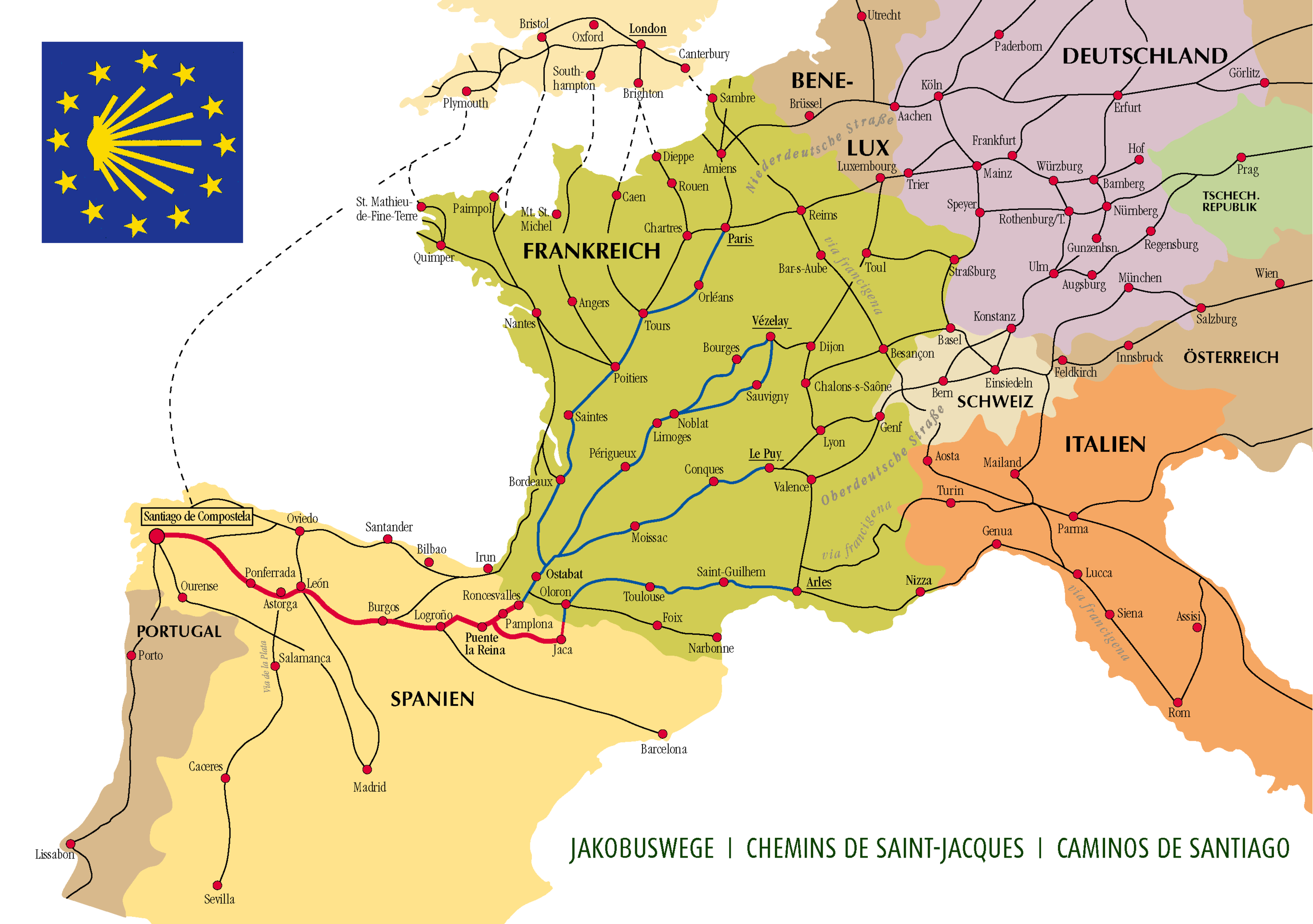
The Camino de Santiago is historically a Christian pilgrimage that starts in southern France, down through the Pyrenees mountains into northern Spain where it terminates in the city of Santiago de Compostela. It’s 500 miles, can take weeks (or even months) complete, and it’s something we’ve always wanted to do.
Connecting While Away
I’m a freelance web developer and my business consists of just me. Leaving my client-base hanging for a month and a half without support simply wasn’t an option. My inclination was to say “there’s just no way I can do this”. but then I thought about it some more and began researching web connectivity along the route we would be taking. I was relieved to see that my initial hunch was right. Every day would begin and end in a city or town and all of these stops had multiple options to connect to the internet. Additionally, my iPhone is unlocked, so when there isn’t a wifi connection, an international SIM card would bridge the gaps in connectivity between stops. I’d simply make my phone a hotspot when needed.
Connectivity was no longer an issue!
But then another challenge presented itself.
Traveling Ultra-Light to Avoid Light Fingers
One of many amazing things about “the way of Saint James” is that not only is it hundreds of miles long, it’s also hundreds of years old. People have walked it for a very long time and, as such, towns, villages, and cities have built an entire economy around it. Each stop along the way offers shelter to pilgrims, so we would not have to bring a tent. In fact, everything I’ve read is telling me not to bring very much at all: just a few changes of clothes, rain gear, needed toiletries, wallet and a passport. So the thought of me bringing my trusty MacBook Pro along with so little else, suddenly seemed foolish (not to mention heavier than anything else that will be in my bag).
The other issue is theft on the Camino. It doesn’t happen often, but apparently it does happen enough for hikers to be quite wary and warn anyone who will listen online. Having traveled to a few places on this planet, I am not naive to the fact that theft can occur anywhere. Nonetheless, it did key me in to thinking about hardware alternatives. Without a doubt, if my MBP got pinched while abroad, it wouldn’t be the end of the world (I’ve got redundant backups and such), but it would be an enormous setback for my clients, not to mention my wallet.
So I needed something light as well as something I could part with, without breaking the bank. I initially eyed the new retina MacBooks for their weight, but then back-tracked because of their price and lack of horsepower. I also looked at Chromebooks for their price, and though I was psyched to see how far they’d come, in the end I balked at what they still lacked. Then I looked at my iPad Air 2 and wondered what was possible. It was light to a fault, way less expensive (since I already owned it), and had plenty of horsepower for what I needed it to do. All I needed was a proper keyboard.
iOS 9 to the Rescue
I typically don’t run OS betas on my main devices, but when I saw the recent iPad-only features added into the recent betas of iOS 9, I took the plunge once the public beta kicked off. As of the last version (mid August), iOS 9 feels more stable than ever. And with its improved inter-app communication, multi-tasking, and keyboard support, my iPad feels more and more like a workhorse, and way less of a consumption device.
To prepare in advance, I’ve been using it as my sole productivity device for four weeks now and I’ve been genuinely surprised to see it accommodate 99% of everything I’ve needed to do to keep my business running and my clients happy.
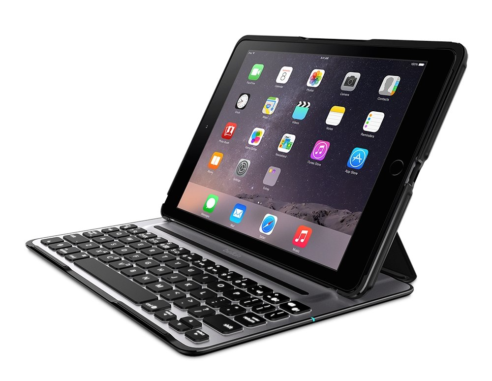
Coupled with the highly recommended QODE™ Ultimate Pro Keyboard Case for iPad Air 2, there isn’t much that I’ve encountered that I can’t conquer with this setup alone.
What About Software?
Ah yes. About that.
My hardware needs have been met, I will be traveling super light, and connectivity is no longer a concern… but quality web development is only as good as the tools you have at your disposal.
I mentioned above, that in my pre-prep there was very little that I could not accomplish with my current iPad and keyboard setup. But hardware has only been half of the equation. In truth, the software is where all the magic has been happening. Luckily, the iOS dev community has created some beautiful, highly capable tools that will help me accomplish my day-to-day.