
It’s not just the morning light in our new home that is amazing...
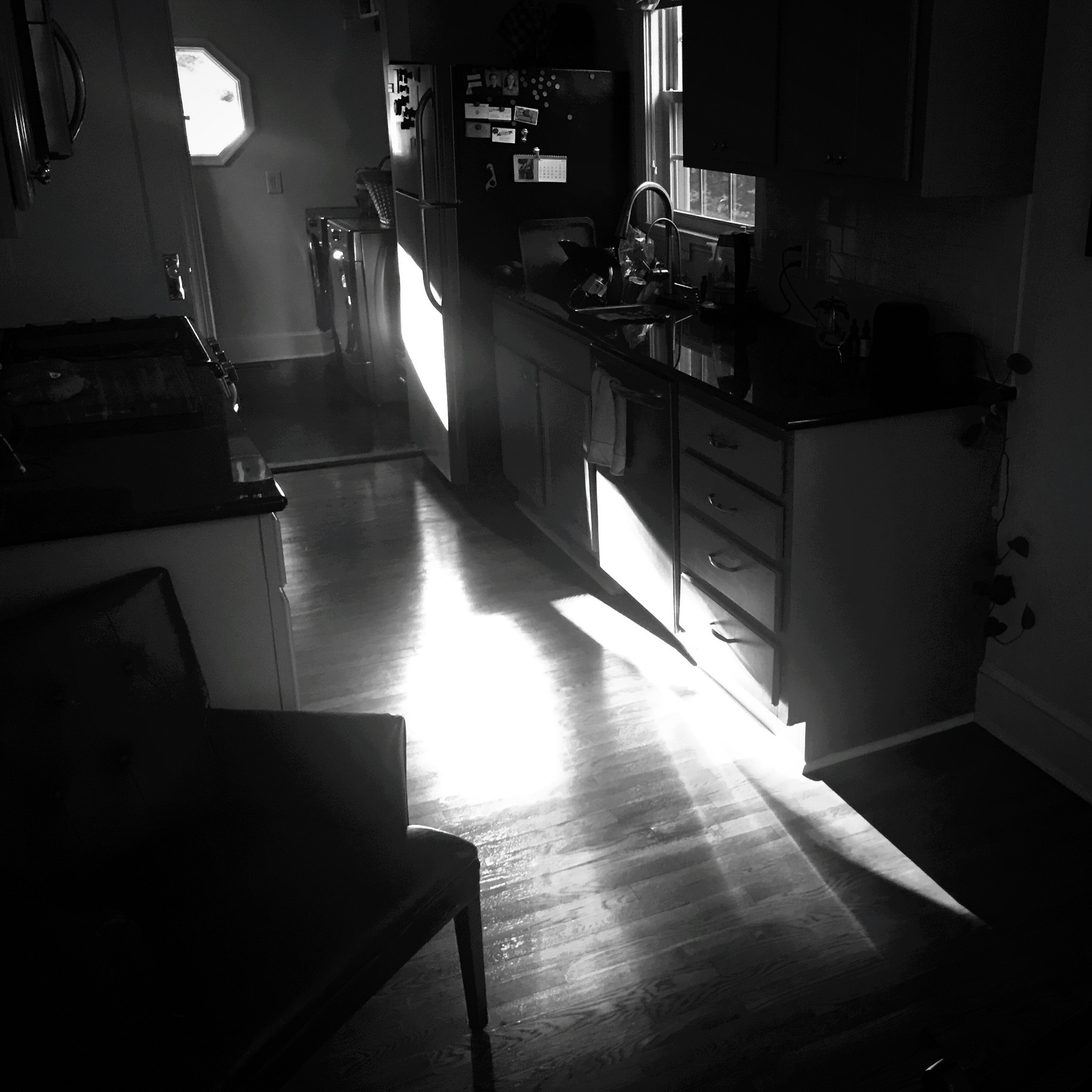
The evening light is pretty amazing too!
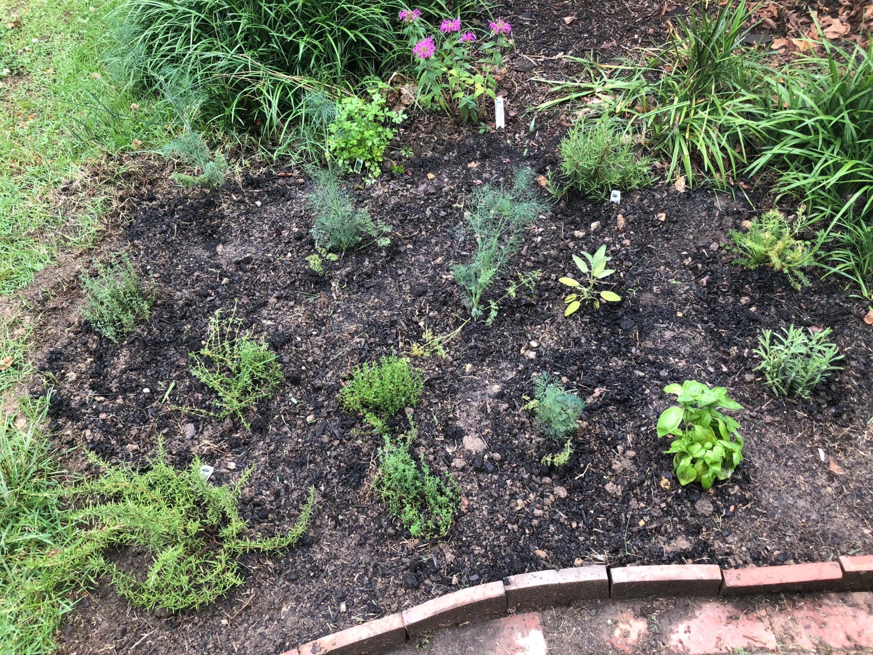
Mel literally sweated out the details getting this herb garden in place on the front lawn before the afternoon rain came…
She got it all in place just in time. 🌧⛈ In the mean time I, frustratingly, tried to play nice with the oldschool reel mower gifted to us by the previous owners. Needless to say, a cord-based mower is being delivered this week.
Been playing with #AirPlay2 tonight in earnest in the casa (AppleTV connected to a home theater receiver and a HomePod in the kitchen setup)…
It took a little volume tweaking on the AppleTV but, after that, it’s been lovely to walk from one end of our home to the other and have it blanketed in sound from a playlist that we created years ago. I have a, sometimes, unfortunately critical ear and I’ve been genuinely shocked at how well the 2 separate sound sources have synced.
So far it’s been pretty damn awesome…
Looks like The Bachelorette is back on?
(Cracks knuckles and dives into Twitterrific’s muffles)
Obscura 2 is out!
A picture taken with @BenRiceM‘s first version of @ObscuraApp earned me $600 in gallery sales (one copy is said to be hung in the office of a local government official). So, yeah, it’d be an understatement to say that I’m all in on #Obscura2 (& its filter packs). If you haven’t yet, you should definitely check it out. It’s made iPhone photography different and delightful for me. itunes.apple.com/us/app/ob…
Nothing distills the aging process more than watching your parents go through a major surgical procedure.
My mother, who is in her early 70’s, is receiving spinal surgery, and I am amazed at how resilient our bodies are. We never know the hand we are dealt with these shells we are given at birth.
Welcome, officially, to version 5.0
Whoa… this is quit the difference isn’t it?
Well, you’re certainly not wrong, I’ve moved this site of to an entirely new platform. That’s right, I’ve very deliberately put all of my eggs in the Micro.blog basket.
There are many reasons why I’ve made this move from WordPress - and no, it’s not because I’ve suddenly become anti-WP - and I plan to post a postmortem of sorts, once the dust settles, I fully kick the tires, and I get used to this new home.
One thing’s for sure though, there’s a lot to love here.
Welcome (again). I am, for the first time in a long time, excited about this site again.
More soon.
I *really* should venture under the house and reroute the cable coax to the entertainment room...
But man, I am stalling big time today. 😅 #homeupkeep #thestruggleisreal 🏠
How many of you have moved your sites to micro.blog?
It’s certainly enticing. I’m just curious how many have actually bit the bullet and made that change. @manton are there any official number you can share? Apologies if this has been posted elsewhere.
Nest Update:
#TurnsOut it was a bad breaker. Swapped it out for a new one and boom! Fixed. Learning about this old house we bought (and love) has been quite the experience.😊🏡 🤪
Slowing down, Volume 2: Walking.
In 2014 my wife and I walked over 600 miles over one of the northern routes of the Camino de' Santiago in northern Spain. Aside from being a life changing couple of months, I also came away with a walking a practice that I’ve stuck to ever since.
Of all the things you can pick up in a lifetime, you’d be hard pressed to find a better way of slowing down than walking from point A to point B. It requires planning. It requires patience from yourself as well as anyone else you are trying to incorporate into your life.
And yet, for me anyways, it’s become a form of meditation that I’ve yet to duplicate whilst doing anything else. The zen-like stillness I achieve while walking places has been life-changing. I am happier for it. I am more centered in my work and in my play. I am moving my body. I am inhabiting the planet in a kinder way. I am out in my community, amongst my neighbors. I am outside, the open sky above me.
Yes, you have to plan when you will be places and augment your day’s schedule accordingly. Yes, this is all in addition (or in supplement) to what you are were attempting to accomplish before.
But… having done it regularly for 3 years now - averaging 5 to 10 miles a day - I wouldn’t change this practice for the world.
About the only bad thing I can think of is the amount of sneakers I’ve been going through (if you know of a good sneaker recycling option, leave it in the comments below). Everything else has been utter improvement.
And the hits keep coming!
Nothing starts your week off better than your Nest thermostat not receiving power from your HVAC unit (over the weekend) and that unseasonably warm weather you’ve been having for a week, moving on out starting today. 😬😭
About the highest compliment I can give #HomePod...
…is that I am manufacturing reasons to hang out in its general vicinity, just to re-listen to music that I’ve owned for years.
It genuinely sounds that good.
Totally love this new product on a thoroughly unexpected level.
Even with the hype, this thing sounds AMAZING!! I pony’ed up a for “smart” speaker that (hopefully) sounded incredible. Playing all kinds of music right now, I don’t regret this investment… not in the slightest. We are, first & foremost, music lovers in our home. #HomePod
The more I read these #HomePod reviews, the more I feel like I’ve slipped into an alternate geek reality.
Everything that is on the tin (superior audio first - with Siri) reflects exactly what I’m looking for in a networked wireless speaker for my home. Audio 1st. Siri 2nd.👍🏼🔊
Oddly Relaxing Videos...
Hey y’all. Every once and a while I just need to zone out and watch something innocuous that isn’t over stimulating or representative of my country’s current political environment (yep, I’m American).
Over the last year I’ve stumbled upon two YouTube channels that really help me wind down whilst teaching me new concepts or illuminating ideas that I’d always wondered about. On both channels there is typically no narrator. Just someone putting forth a visual objective and then proceeding to show you how they achieve it. In many ways it reminds me of those old cooking shows from the 70’s and 80’s.
Anyways, I thought I’d share them with you in the event you ever need a similar escape.
The first one is a channel called “Hand Tool Rescue” and it’s just a guy restoring old tools that he’s either found or have been sent to him. There’s all kinds of interesting stuff that he takes apart piece by piece, cleans/repairs, and then puts back together, restoring each tool to its’ former operational glory! I just love this!
Here’s the link: https://www.youtube.com/user/erzzi6
The second is a channel called “Primitive Technology” and it features another guy who finds a space on his land where he proceeds to build primitive structures and tools from objects found around him. So if the idea of watching someone walk into a heavily wooded area with no tools at all, eventually build the tools that allow him clear a space to build a structure to protect him from the elements, is interesting to you - this comes highly recommended.
Here’s the link: https://www.youtube.com/channel/UCAL3JXZSzSm8AlZyD3nQdBA
I find both of these channels immensely interesting and often mesmerizing. Hopefully you will too! If you have similar recommendations feel free to put them in the comments below!
The sheer amount of AirPods owners in my city (Durham, NC) is really surprising.
Tons of diversity in ownership too. Kids to elderly. Every ethnicity.
Apple really crushed that one out of the park.
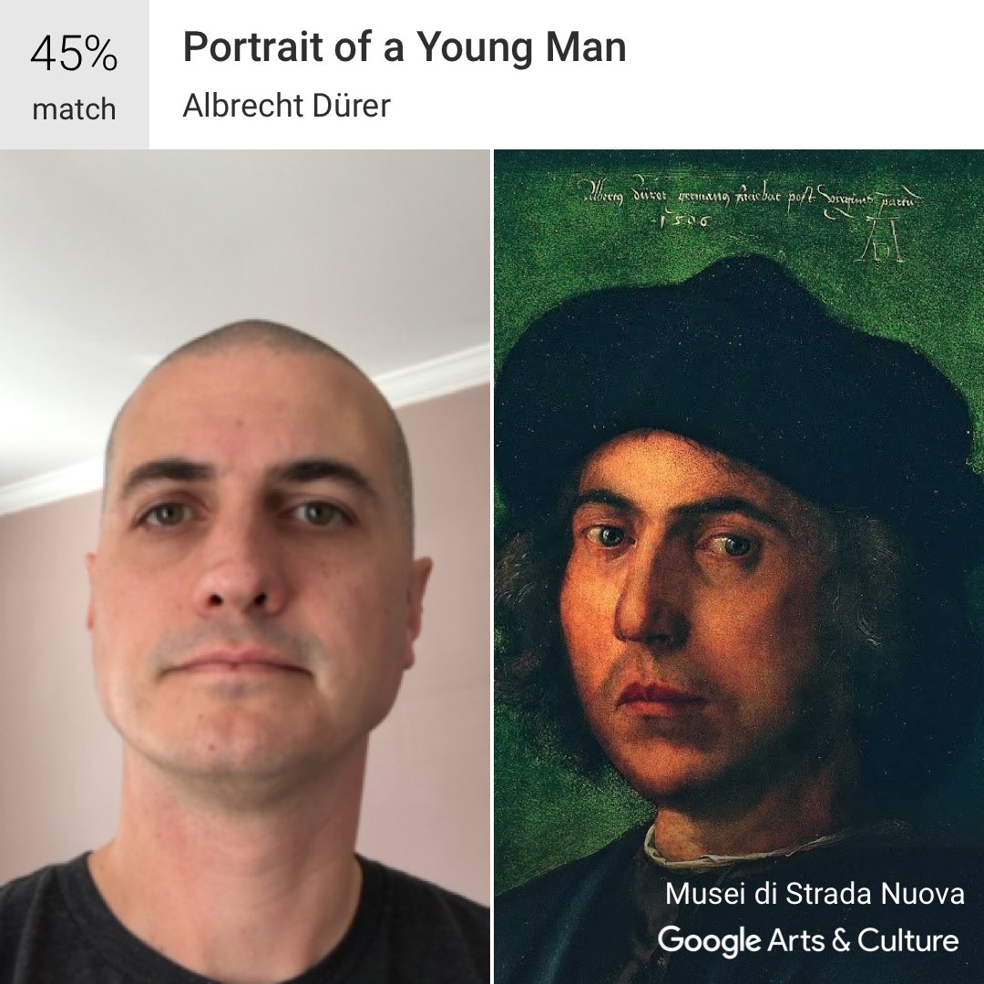
On today, my 42nd birthday, I’ll gladly take “Portrait of a Young Man” as their auto-churned output for my likeness. 😊
Seriously. Every single time I use Coda to fix an issue with a client site or my own projects - on my iPad - it just feels like magic. Like I am doing something dodgy or mischievous… and I absolutely love that feeling.