
Am I the only one that is driven batty by the fact that there still isn’t a “delete” option in the slide-in notifications for Mail on MacOS? That seems like such a no-brainer.
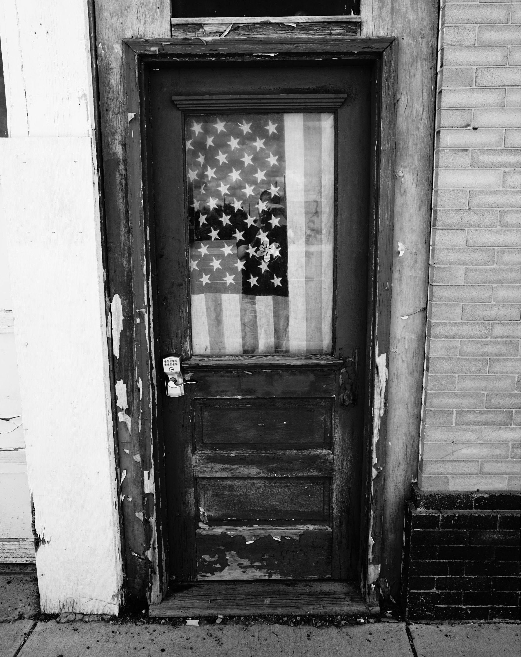
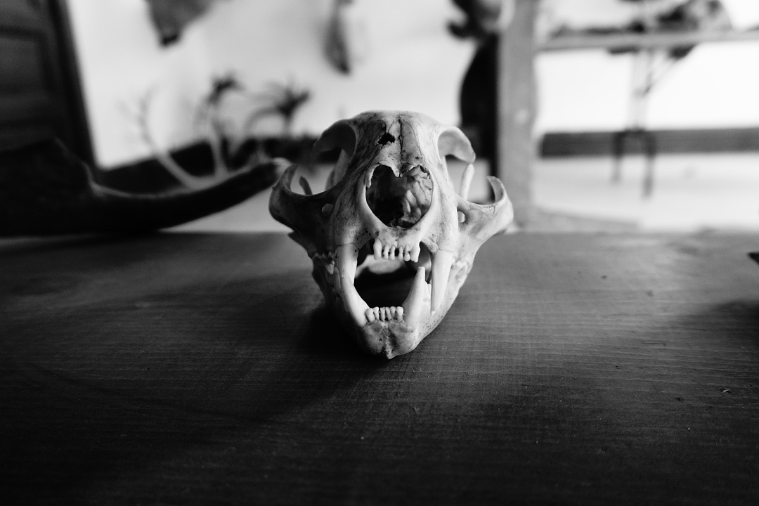
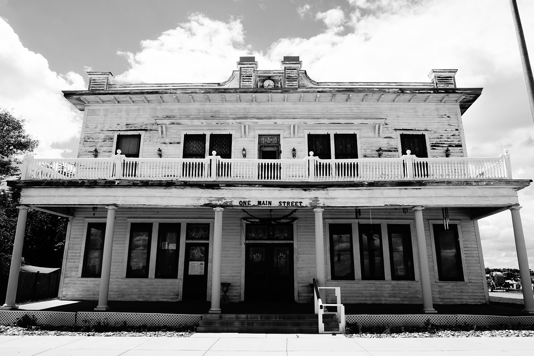
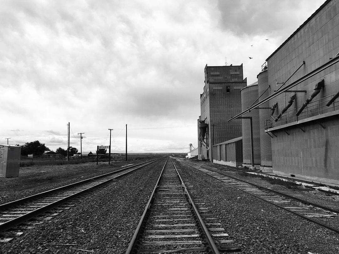
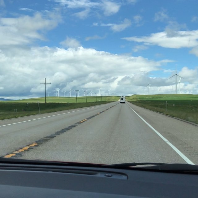
Brief stop in Lavina, MT… 🇺🇸💀
Installed the first public beta of Mojave on my 2016 MBP last night.
I know, I know… not a wise move for one of your main computers. I have back ups though and a good amount time at the moment, so I thought I’d play.
Believe it or not, this was the first public beta I’ve ever had a serious issue with. Upon boot up, it would show the progress bar (with my profile photo) and simply freeze at the very last second. Progress bar full. Left it for 20 minutes a few times. It never made it to the desktop.
Tried several reboots and disk diagnostics (disk was fine), and the only thing that solved it was a reinstall from recovery mode. Nothing was lost locally and, all and all, it’s a solid release as far as I can tell. Still gotta kick the tires for a few more days though.
I know everyone and their Mom has been posting these types of tales but, for me at least, I find them immensely helpful when I am stuck between a rock and a hard place. So I figured it couldn’t hurt to post this up for reference.
It’s a beta folks, if you don’t at least expect issues like these, you’re walking willy nilly into field of bear traps.


Making our way back to you babes… (also Billings, MT ✈️ ) 🚗
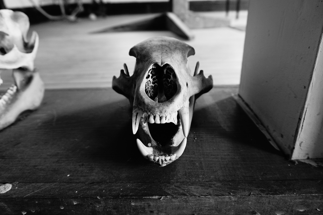
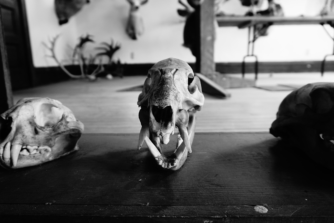
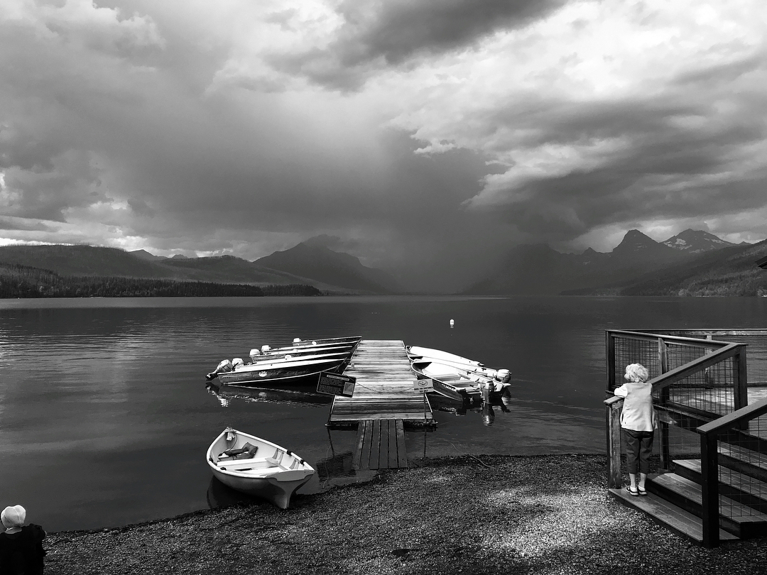
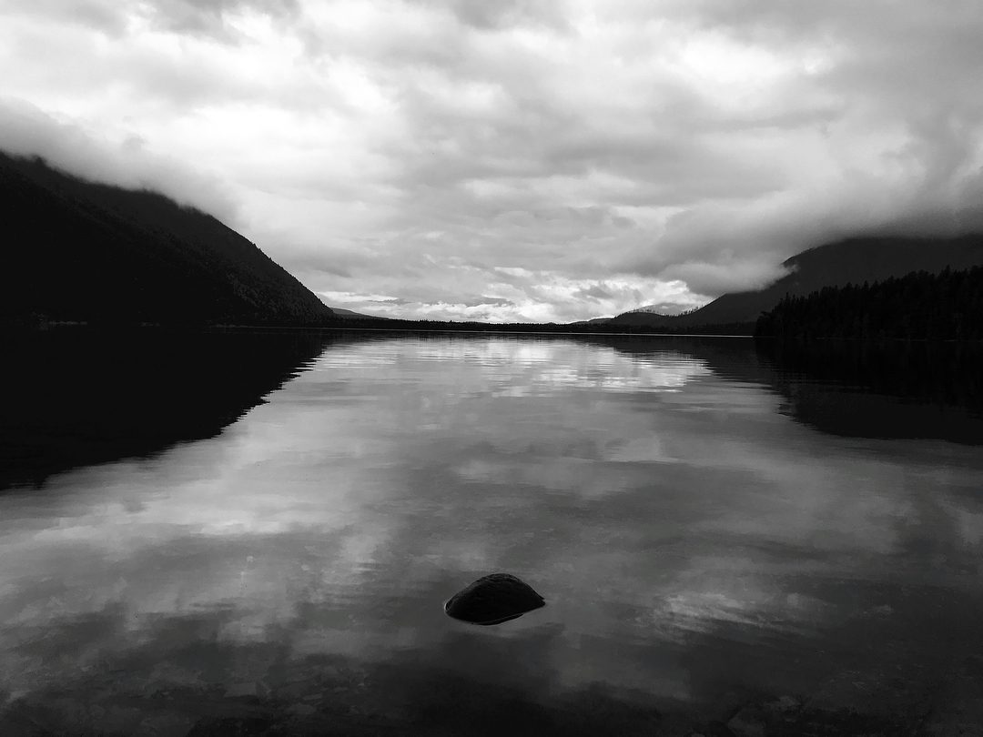
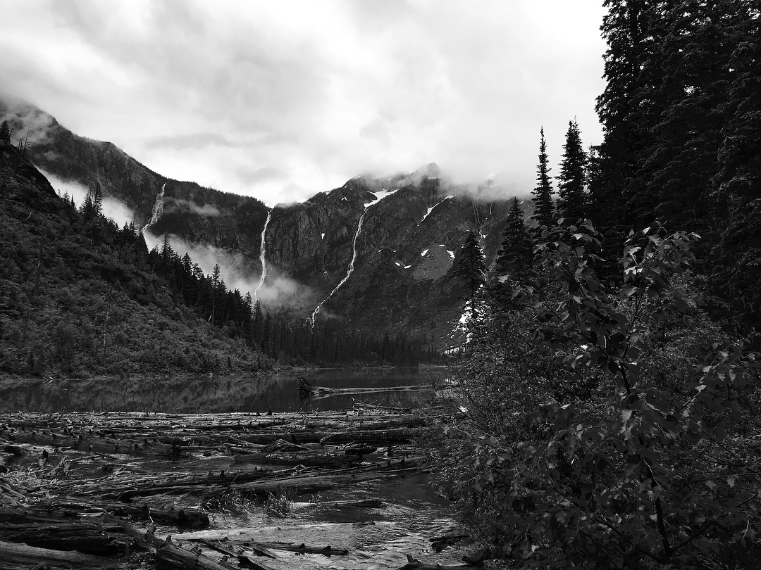
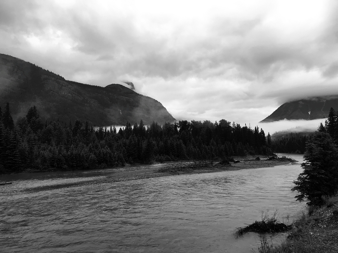
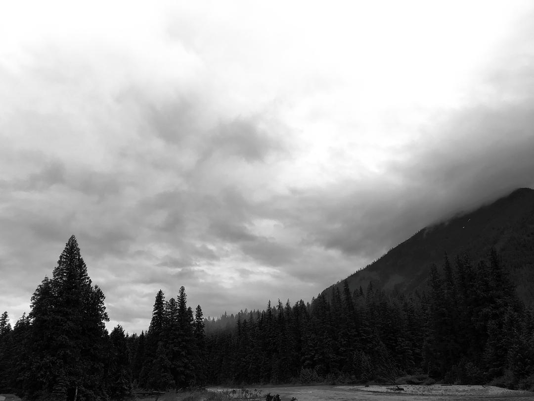
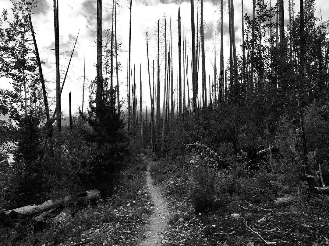
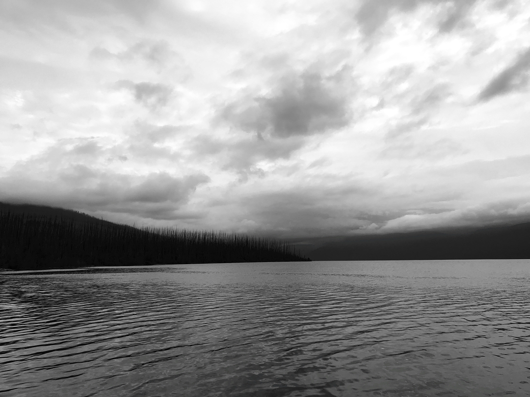
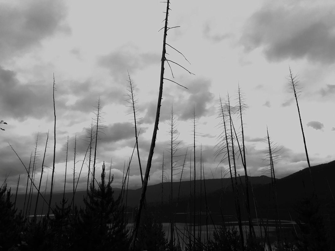
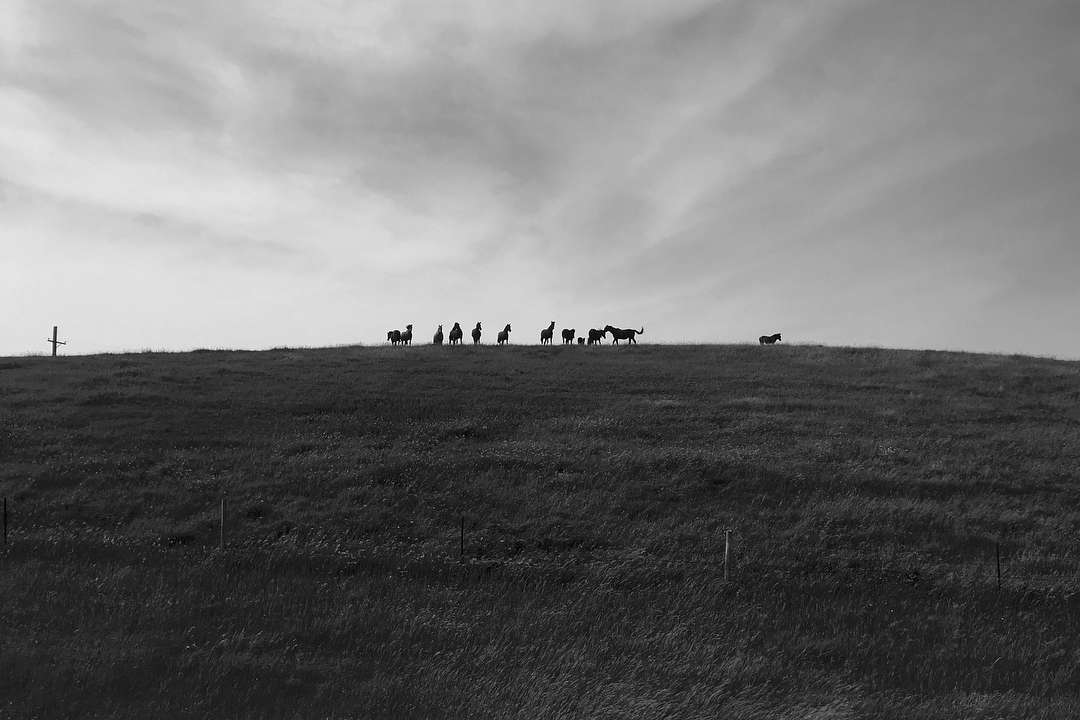
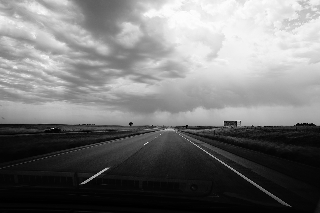
Some B&W’s from time spent in Glacier. Winding down a road trip is always bittersweet. Especially one like this.

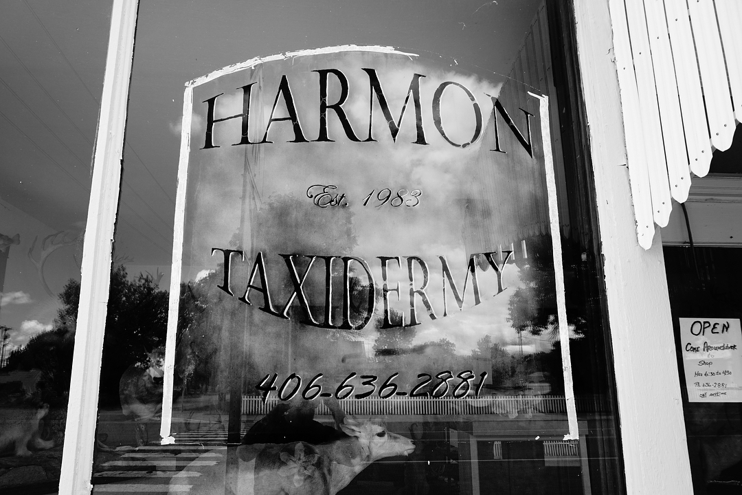
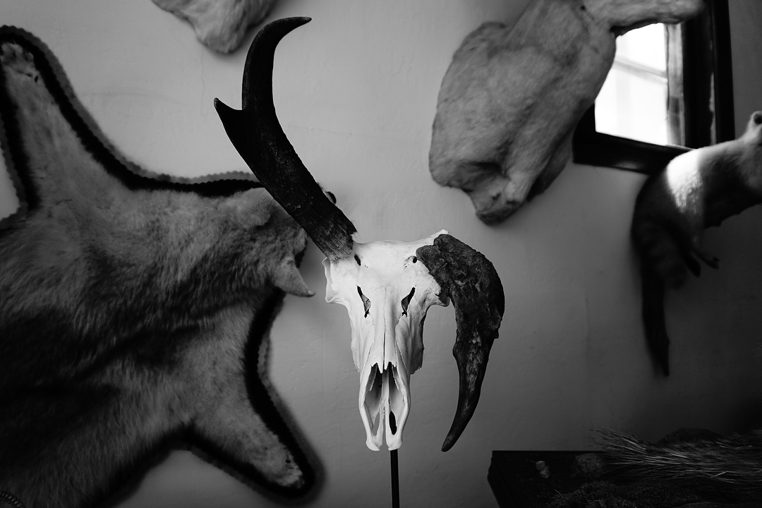
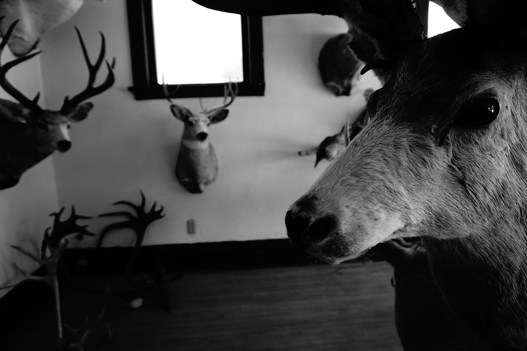
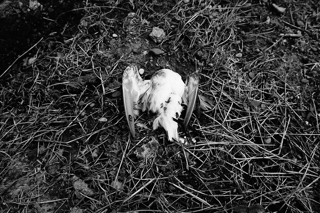
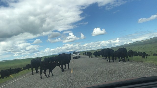
Yeah… so… this happened. #montana 🐂🐄
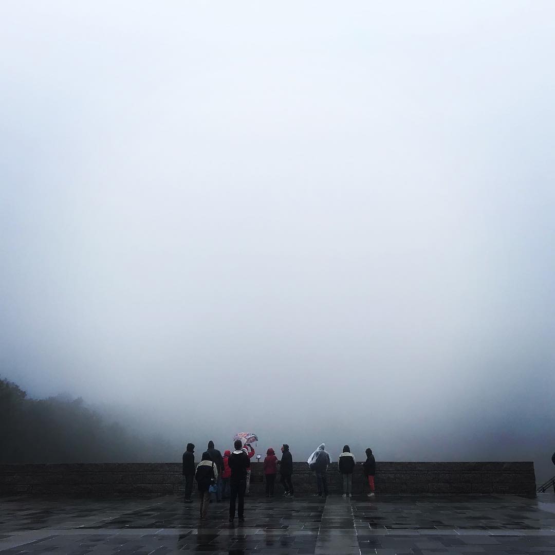
Hands down, the most beautiful thing @justincookphoto and I have seen on this trip was #mountrushmore. #zerovisibility #SoBlessed
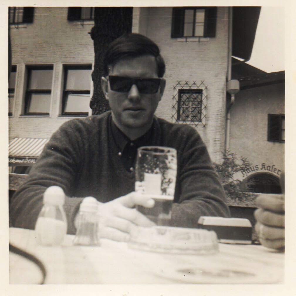
#HappyFathersDay to a man who’s always had my back and always nurtured my creativity from day one. Wish I could say I inherited all this handsome (and those dope sunglasses 😎) but at least I got your sense of humor. Love you pops!
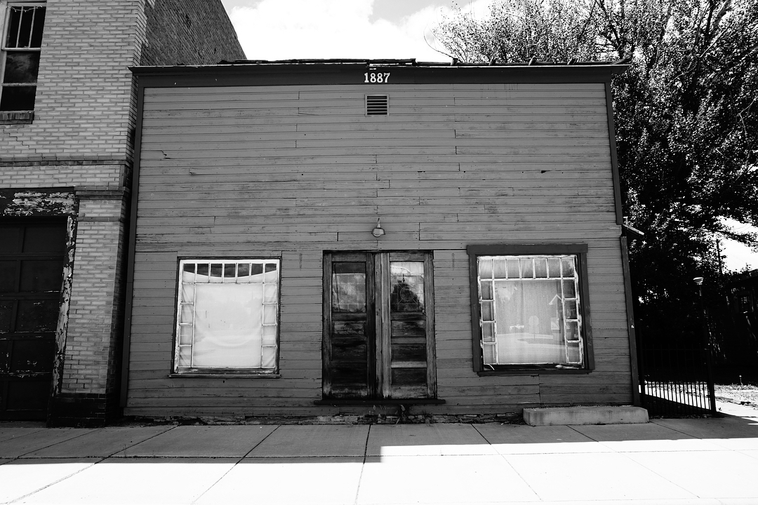
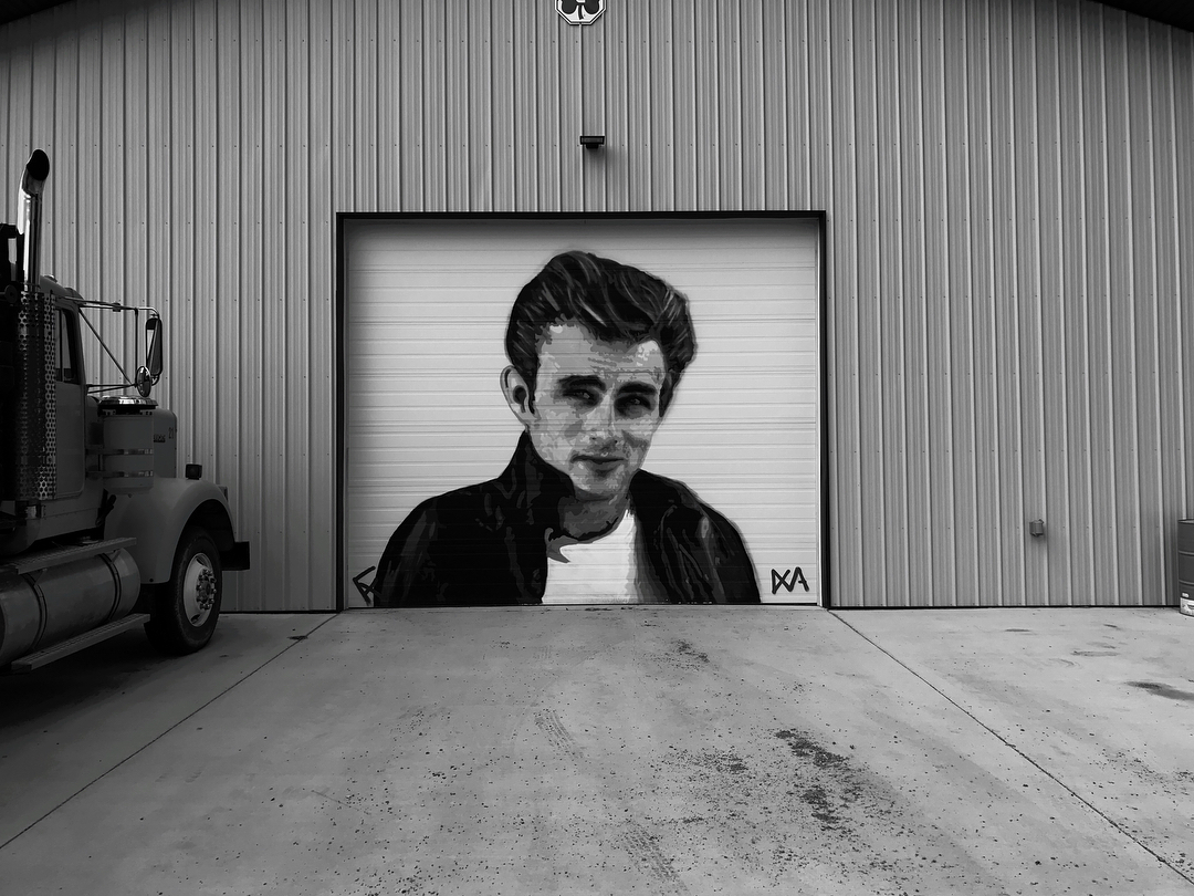
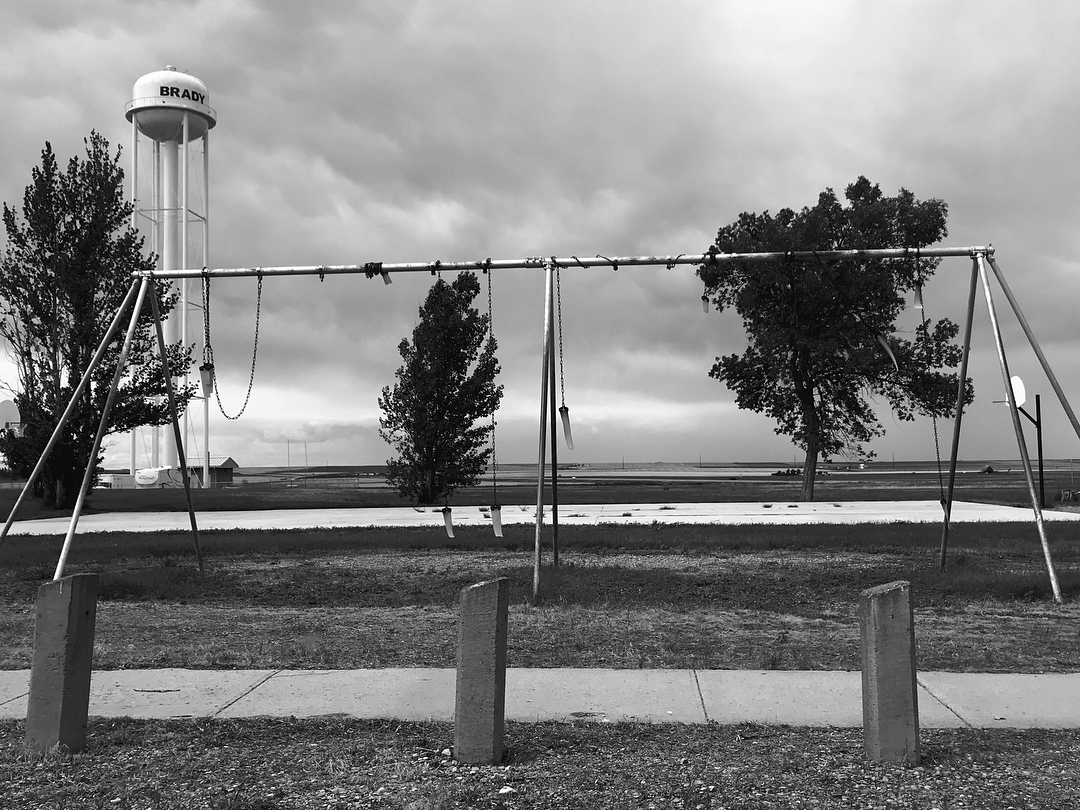
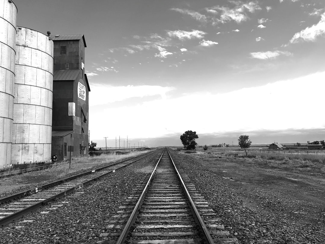
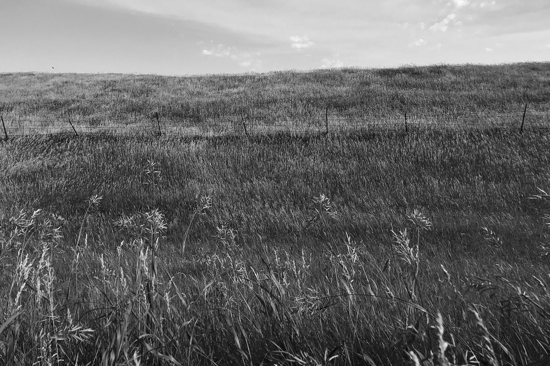
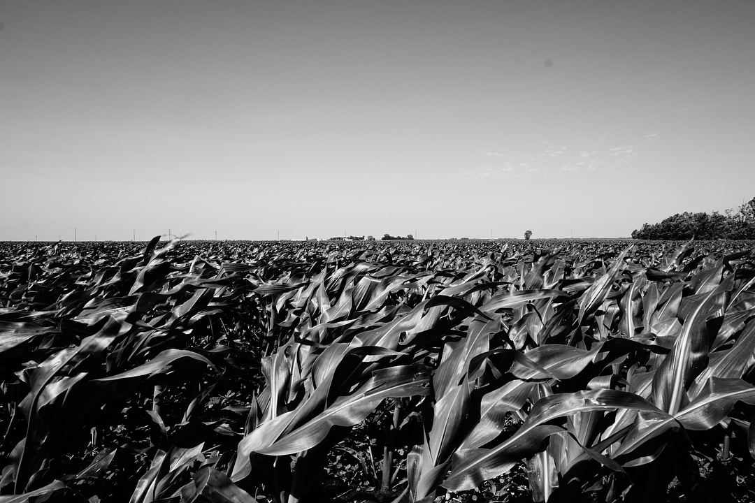
Some B&Ws from a thoroughly awesome day one on the road.
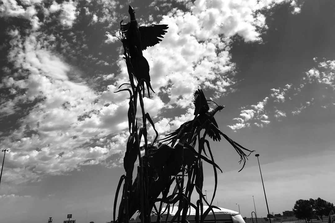
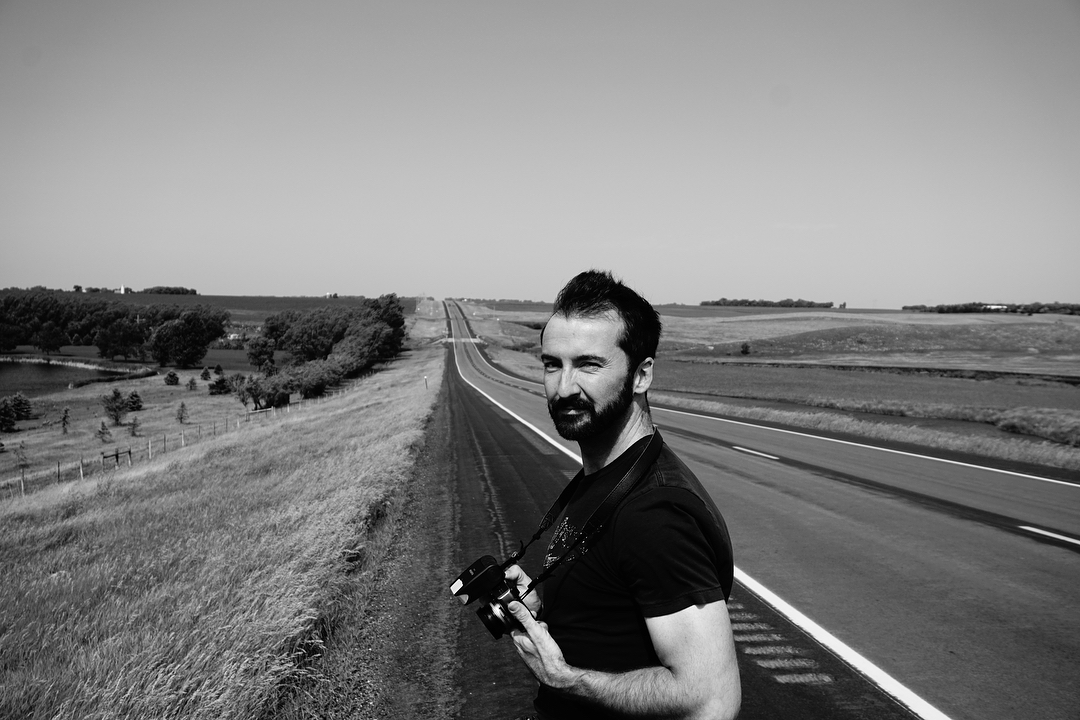
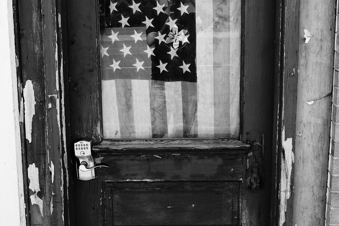
NBD… just @justincookphoto making America great again… or something. #MAGA #YepThatIsAnOldSchoolCoinPurseInHisRightHand (taken at the world’s ONLY #CornPalace in beautiful Mitchell South Dakota)🧔🏻🇺🇸🌽

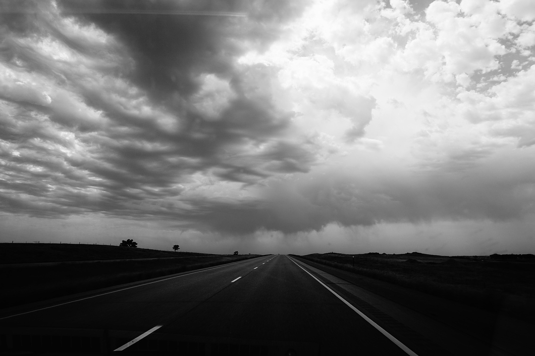
Meeting of the minds before the storm
I don’t need a reason to love my city/community…
But seeing these reminders every once and a while is pretty damn nice.
Here’s an early morning smile for y’all! 😊
『Hit Like A Girl Contest 2018』Good Times Bad Times - LED ZEPPELIN / Cover by Yoyoka , 8 year old drummer vimeo.com/263985244
About to embark on a week and half trip into the badlands (not the show - which is awesome - the US national park)...
We’ve got some great sights lined up, but I figured I’d hit up my micro.blog community for some insider tips that my traveling partner and I can’t glean from a book.
Aw Sense8...
I am so sad to see this adventure come to a close. But man, I’ll always be forever grateful that we even got an ending.
The Move To Micro.blog
A few months ago I was alerted to the fact that hosting for this site was going to need to be renewed and, well, it got me thinking about changes.
I’ve run various incarnations of this site on WordPress for well over decade. Much of my company’s revenue comes from sites running WordPress. It’s been comfortable for me and, in many ways, has taken care of me and my family for years financially. But here I was, at this decision to re-up my hosting and I realized that I needed - no, I wanted - to make a change.
Micro.blog has been on my radar ever since the initial Kickstarter. My go-to clutch of tech-related podcasts all mentioned it at one time or another and I immediately fell in love with idea behind it. As I am wont to do, I sat back, watched it grow and evolve with care and intention over time. It made me curious about something new (that was birthed from something old) and made me excited about what was coming next.
As soon they opened it up to non-backers I snagged an account and waded in. The rest is history. I migrated years content from WordPress and imported it all seamlessly to a paid Micro account. The old hosting account is closed and a new chapter has begun! Like every major revision of this site and its focus, there are some obvious changes to behold. You’ll witness an uptick in smaller, tweet-like posts which, hopefully, will lend to more concise and fleshed out longer posts. Regardless of the type of output though, I am looking forward to using this space again. It’s not lost on me at all at how much it has languished over the last year or two.
I plan on putting together a postmortem on the migration from WP to M.B at a future date (spoiler alert: it was surprisingly easy with a few gotchas that were, if I’m being honest, mostly self-induced). Oh and for the record: this move is not a boycott of WordPress. I still recommend it for SO many endeavors and will continue to do so. It’s just that, right now? It’s a bit of a sledgehammer-being-used-on-a-tack-nail as far my personal needs are concerned.
There are still some visual tweaks I want to do with the current chosen theme but, for now, I am immensely happy to be here and to be a part of this community that is trying to make the web what it used to be: kind, open (in both web standards and arms), as well as a place where our words are ours and not some product that companies are constantly trying to harness.
Micro.blog already feels good. I feel at home here.
And that’s a lovely feeling. 😌
Apple Maps Now Supports Transit in North Carolina - Mac Rumors I’m sure this has nothing to do with a former Duke grad bringing his company to the triangle…